EZA
A downloadable game for Windows and macOS
Download NowName your own price
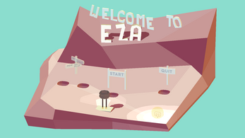
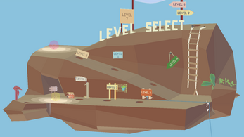
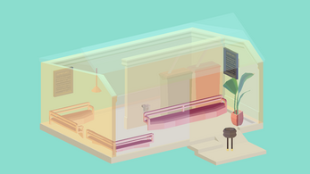
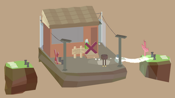
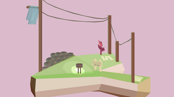
EZA is a relaxing 3D puzzle platformer in which you play as a the bottom half of a lightbulb that has lost it's light. You must find the light within each level to reveal hidden environments, paths and solutions to it's secrets.
~ * ~ * ~ * ~ * ~ * ~ * ~ * ~ *
CONTROLS:
WASD to move
mouse to rotate camera
SPACE to interact (grab lightbulbs, flip switches)
BACKSPACE to restart level
ESCAPE to teleport
Download
Download NowName your own price
Click download now to get access to the following files:
EZA Windows Build.zip 50 MB
EZA macOS Build.zip 55 MB


Comments
Log in with itch.io to leave a comment.
I like the idea of the game but it would be nice, if I could just replay the level, when I fall of the stage
hi! that is already a mechanic that is implemented!
if you press backspace you should be able to restart the scene :)
Hey!
A real fan of the low-poly + low-saturation visuals. Simply sublime and also a detailed minimalist! Especially level 3, that was intense.
The game was puzzling, and that's exactly what a puzzle game should be doing to me. But I had a lot of "what should I do?" moments, and not many "how should I do it?" moments. Though the game is about revealing hidden environments, if end of each level had more clarity and uniformity (like the start selection level [Pick light bulb] -> [Place it in the hole]), dense players like me can fully engage in solving the puzzle, and not finding the puzzle.
On a brighter note, you really nailed it with the 3D aspect of the game and the reason as to why those two levels were discarded is probably the biggest puzzle of all.
Would love to see more :D
hi!
thanks so much for your feedback and saying that you like the visual style!
you are totally right when you say that the levels aren't very clear and it is something that i will have to fix.
when i was making this game i was trying to not use any UI at all, mainly because i enjoyed a very minimalist look (the lack of UI and just seeing the physical level on the screen etc), so i ended up using 3D signs in the levels to teach players the mechanics. what i didn't think of, was of telling them what to do because the levels are quite short and i thought i'd just let the players explore! that being said, i should definitely implement some sort of "help! i don't know what to do!" button or something to help players.
and the reason for the discarded levels is that this was a university project (it is my first game that i've ever made!) and so i had to stick to a deadline and didn't have enough time to design or polish the mechanics of those levels.
anyways, i'll keep your feedback in mind! thanks for commenting! :)
thanks so much for your feedback! i'm glad you enjoyed the game! c:
but you're right! i do have to fix the bugs and also some switches that don't seem to give the player feedback when they're pressed!
thanks! ^^